Signal Flags in Greyscale
Originally published in the Vexilloid Tabloid, no. 95,
Ted Kaye’s Good Flag, Bad Flag suggests that a good flag design should work even in greyscale. If a flag’s colors can’t be made out – at a distance or in bad weather, perhaps – the design should still be recognizable.
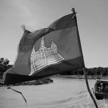
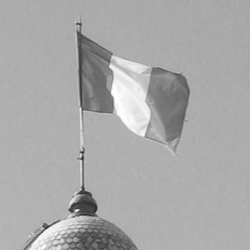
By that criterion, a busy design may hold up better than a bold and simple one. In a black-and-white photo, the Cambodian flag is still unique; the French flag is indistinguishable from a dozen other national flags.
For signal flags at sea, this is even more important. These flags’ sole purpose is to communicate clearly, even when visibility is poor; a single mistaken letter could lead to serious error or danger.

Whether by design or fortunate accident, the flags of the International Code of Signals pass this test. If all that can be distinguished is dark and light, the I.C.S. alphabet flags are all still unique . . .
Except for two. The letters H and K are both vertical bicolors, light at the hoist and dark at the fly. It’s surely too late to change things now – but it would have been helpful if one of those two could have been oriented the other way around.


